Keener Living now runs on a new, simplified design, and I need your feedback if you encounter any problems with it. Hopefully the commenting system works well, so feel free to leave a comment here regarding your thoughts. But, you can also feel free to leave an email for me at brucekeener [at] gmail [dot] com
I chose this design because I found it to have a certain eye-appeal, because it loads really quickly, and because of my confidence in the designer, Khoi Vinh: he was the Design Director at the New York Times for about 4 and a half years.
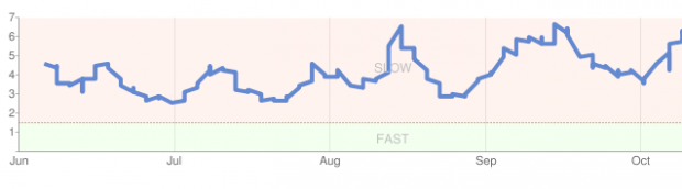
My previous designs were loading too slowly, as indicated in this graph for my site from Google’s Webmaster Tools reports, which shows load times approaching 7 seconds at some points:
I’ve spent several days analyzing this, because it is important to me that you have a good experience with my site. I found that using Google Ads contributed to slower loading, with the ads sometimes taking 3 seconds to load (completely unacceptable).
So, I am not using Google Ads again until they get their problems straightened out. And, I found that I was using images where they weren’t adding value, and that the images slowed down the loading. So, I deleted a lot of unnecessary images and intend to only use images when they really add value.
I also just got tired of fooling with “framework-based designs,” which supposedly make life easier for me, but which add thousands of extra lines of code to the production of each page. I wanted to get back to the basics and use a design that only had a few hundred lines of code, not thousands. Given how fast today’s servers are this latter factor is probably not all that significant in terms of page load.
But, every little bit matters to me. And, it especially matters because I had to turn caching off (the caching plugin was interfering with comments).
As part of getting back to the basics, I am also turning off the Mobile plugin. It adds a little bit of sluggish to the site, although not much. The main reason I am disabling it is that I think you get a better viewing experience on the iPhone, Touch, iPad, and Android devices by just viewing the raw page.
(This site looks the best on an iPad that it has ever looked.) The mobile plugin uses a font that is too small for me, and probably for many of you, too. So, mobile users, give me some feedback on this. I am not opposed to using the plugin if it provides value.
My move to kill it off is based on what looks best to me … but I need to know what looks best to you.
I hope this is a good move for all of us. Let me know what you think.